To make your look harmonious and stylish, it is vital to understand how to properly combine the different shades you choose for your outfit. After all, regardless of how expensive your clothes are, if the colors don’t go well together, your appearance won’t be what you’d like it to be. We want to give you some useful tips on this topic today.
First of all, you should get acquainted with the color wheel. It is indispensable for beginner artists and teaches you how to combine colors in your wardrobe, work with contrasts, and create harmonious color combinations in the interior.

If we look at the circle, we can see:
1. The primary colors are red, yellow, and blue. They are not created by combining other colors.
2. Secondary colors are orange, purple, and green. They are created by mixing primary colors.
3. Tertiary colors are a combination of secondary and primary colors. For example, a variety of red and orange gives red-orange, and green and blue gives blue-green. In this way, we can mix colors indefinitely.
4. Warm and cool colors. Such shades of red, orange, and yellow are warm colors. Cold colors are blue, purple, green, etc.
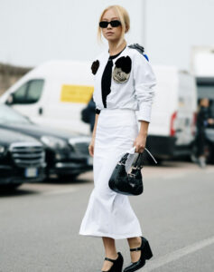
5. Neutral and achromatic colors – beige, cream, white, black, gray. They are perfectly combined with any other color and with each other. White adds brightness and freshness to the image.
Now, let’s look at a few principles of color combination.
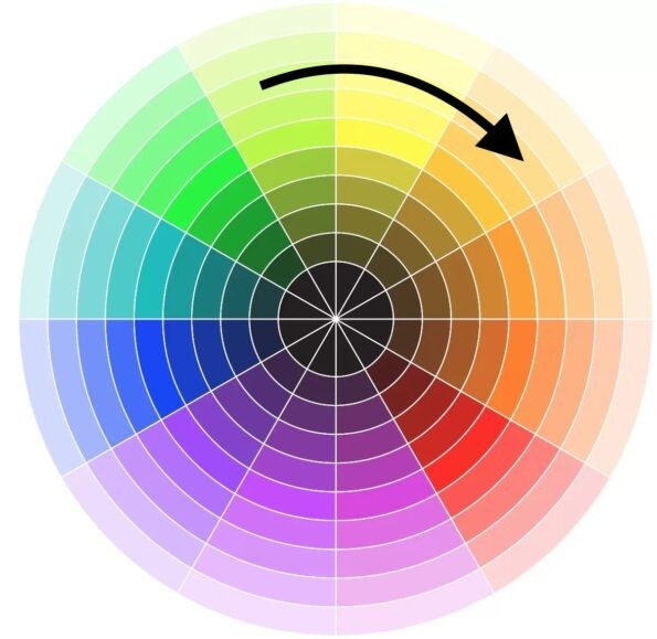
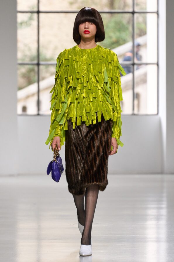
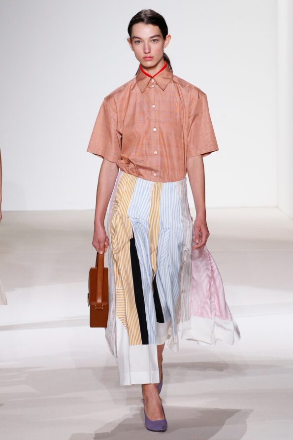
Analog
This principle is formed by combining adjacent colors on the color wheel. For example, green + yellow + orange, or purple + red + orange. You can safely choose 2, 3, or even more shades for such a set. Analog combinations are most often found in nature. That is why they are pleasing to the eye and always enjoyable. For a harmonious look, choose colors of the same saturation and depth.

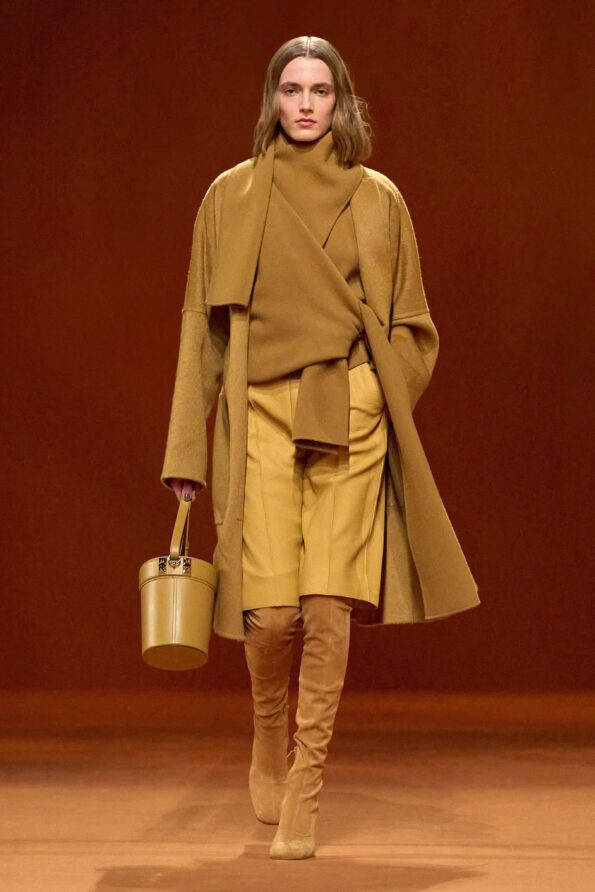
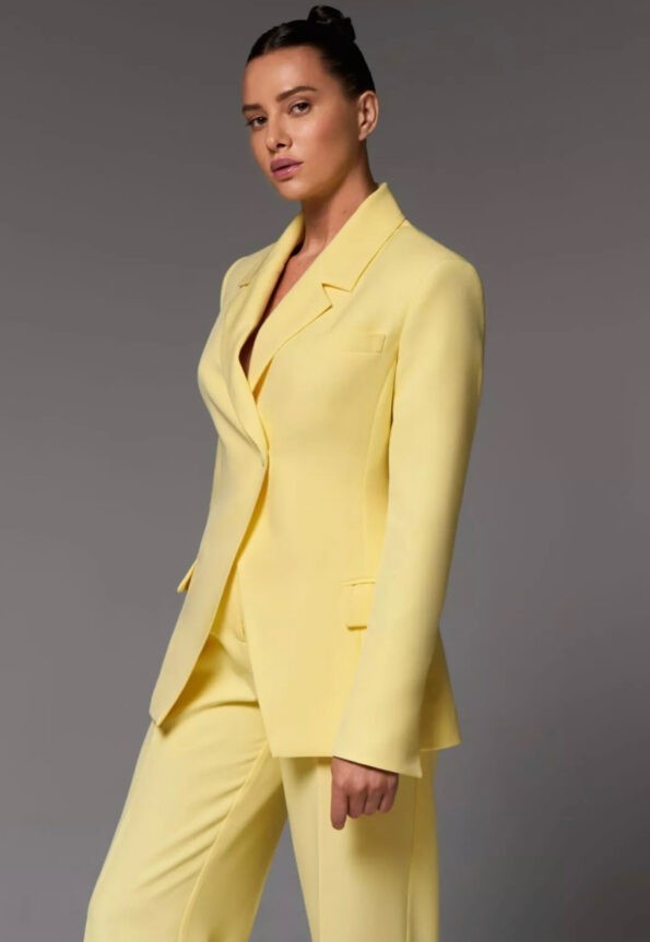
Monochrome
This principle consists of combining colors of the same spectrum of the circle. We can use 2-3 shades of the same color with different saturation and brightness. The monochrome combination can be complemented with neutral shades. And to make your monochromatic not dull, remember about the mix of textures in the image.

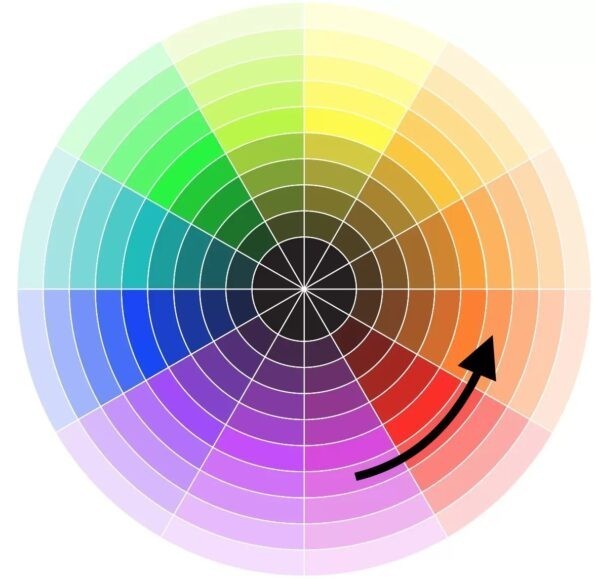
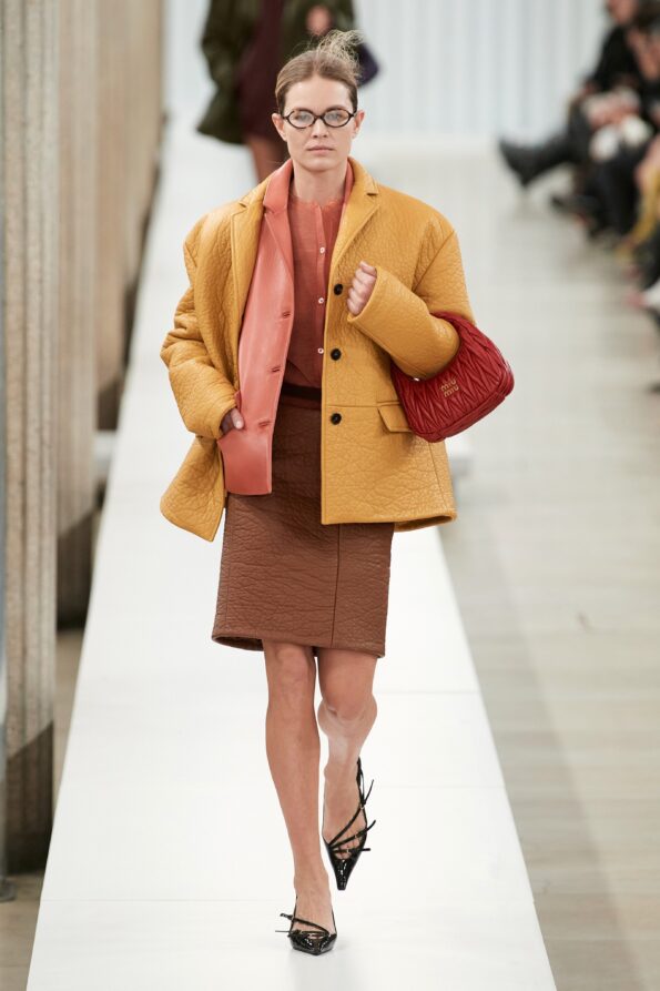
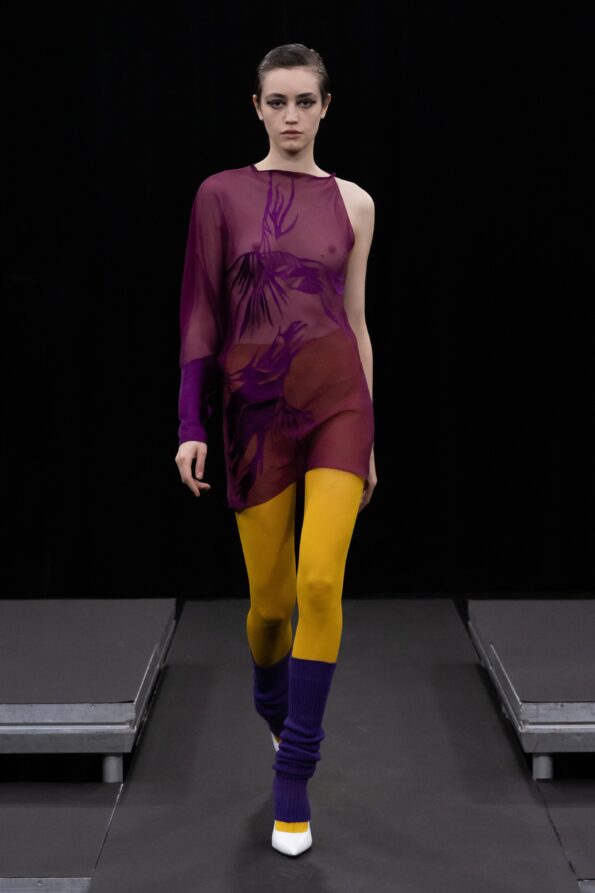
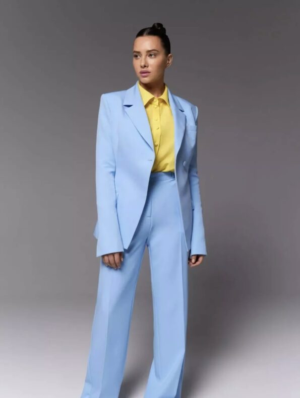
Complementary
Complementary or contrasting colors are placed on opposite sides of the circle. With this combination, your image will look very expressive and bright, so you should consider the proportions when creating such a set. Choose one color as the primary color, and the other color will be complementary. Approximately 70% to 30%. If the bow is too bright, dilute it with neutral shades.

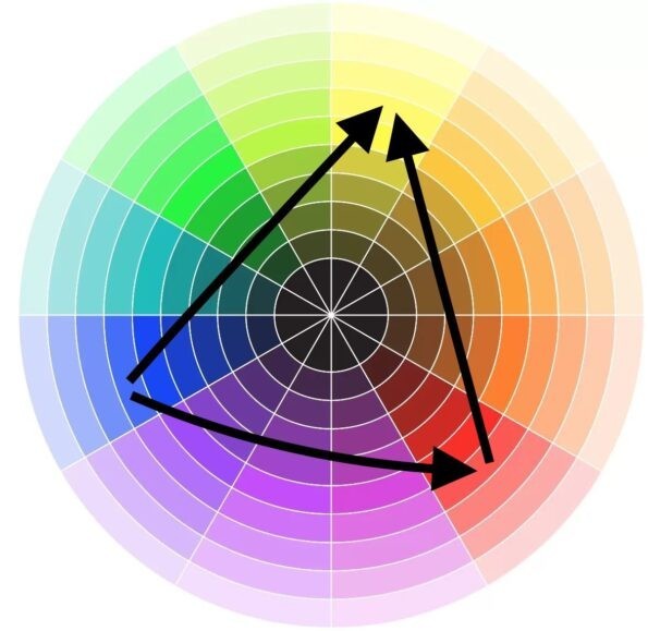
Triad
This is a combination of three colors that are equidistant from each other. You’ll get a very expressive and exciting set, even using unsaturated shades.

Pastels
All pastel shades are perfectly combined with each other because they have a soft, muted look. When you mix such colors, your face looks calm and relaxed.


Whatever color combination principle you choose, you must feel harmonious and confident in it.
The article was written by Irina Kornieva.

Senior stylist at Vivons.
If you want to get a professional stylist consultation, don’t hesitate to call us+380684558700